
Reactでリストを作るといえばコレですよねMUIのDataGrid!
そのDataGridを使い、リストから詳細ページへの遷移をさせたいと思うことが多いのではないでしょうか。
詳細ページへの遷移方法はいろいろありますが、本記事では以下の3つのパターンをご紹介します。
- DataGridのRowをクリックしてページ遷移
- DataGridのRow内にボタンを用意し、ボタンクリックでページ遷移
- DataGridの特定のセルをクリックしてページ遷移
それでは行きましょう!
環境
- react @18.2.0
- mui/material @5.11.1
DataGridのRowをクリックしてページ遷移
以下のような画面を作成することができます。
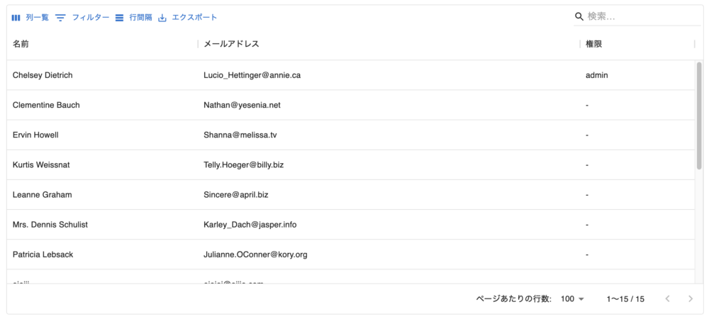
Rowをクリックすると詳細ページに遷移できます。
公式ドキュメントはこちら
const columns: GridColDef[] = [
  { field: "name", headerName: "名前", minWidth: 250, flex: 0.5 },
  { field: "email", headerName: "メールアドレス", minWidth: 300, flex: 1 },
  { field: "admin", headerName: "権限", minWidth: 100, flex: 0.3 },
];

〜 省略 〜

  const navigate = useNavigate();

  const handleRowClick: GridEventListener<"rowClick"> = (params) => {
    navigate(`/users/${params.id}`);

〜 省略 〜

        <DataGrid
          rows={rows}
          columns={columns}
          onRowClick={handleRowClick}
          components={{
            Toolbar: GridToolbar,
          }}
          componentsProps={{
            toolbar: {
              showQuickFilter: true,
              quickFilterProps: { debounceMs: 500 },
            },
          }}
          localeText={jaJP.components.MuiDataGrid.defaultProps.localeText}
          hideFooterSelectedRowCount
        />
ポイントは、19行目のonRowClick={handleRowClick}です。
このようにClickイベントを記述することができ、handleRowClick関数が実行され、userの詳細ページうに遷移することができます。
DataGridのRow内にボタンを用意し、ボタンクリックでページ遷移
以下のような画面を作成することができます。
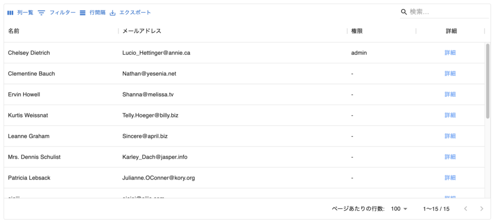
「詳細」列の青色で表示された詳細ボタンをクリックすると詳細ページに遷移できます。
公式ドキュメントはこちら
renderCellというものを使い、columns内で設定します。
const columns: GridColDef[] = [
  { field: "name", headerName: "名前", minWidth: 250, flex: 0.5 },
  { field: "email", headerName: "メールアドレス", minWidth: 300, flex: 1 },
  { field: "admin", headerName: "権限", minWidth: 100, flex: 0.3 },
  {
    field: "show",
    headerName: "詳細",
    headerAlign: "center",
    align: "center",
    sortable: false,
    minWidth: 100,
    flex: 0.3,
    renderCell: (params: GridRenderCellParams<any>) => (
      <>
        {console.log(params)}
        <Link className="text-blue-400" to={`/users/${params.id}`}>
          詳細
        </Link>
      </>
    ),
  },
];

〜 省略 〜

        <DataGrid
          rows={rows}
          columns={columns}
          components={{
            Toolbar: GridToolbar,
          }}
          componentsProps={{
            toolbar: {
              showQuickFilter: true,
              quickFilterProps: { debounceMs: 500 },
            },
          }}
          localeText={jaJP.components.MuiDataGrid.defaultProps.localeText}
          hideFooterSelectedRowCount
        />
DataGridコンポーネント側の設定は特に不要で、columns側だけ記述すればOKです。
「詳細」のtext colorはtailwindCSSを使って青色にしています。
paramsに何が入っているか確認できるように敢えてconsole.logを入れていますので、ログを確認してみてください。
ここでは、paramsのidのみ使っており、そのidを使ってpath指定し遷移っさせています。
DataGridの特定のセルをクリックしてページ遷移
以下のような画面を作成することができます。
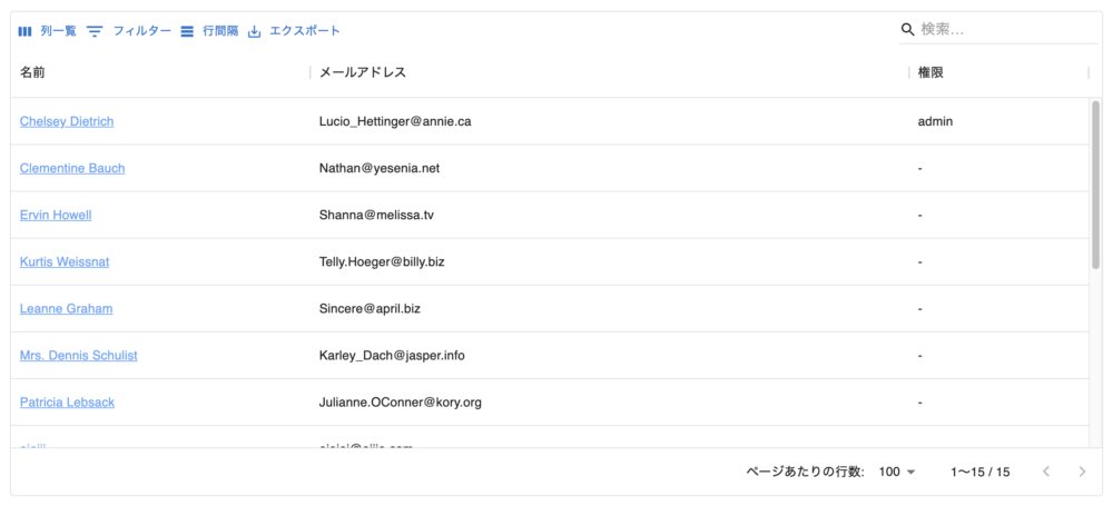
Rowの名前をクリックしたら詳細ページに遷移できるようにします。
上記の詳細ボタンを用意する方法とほぼほぼ同じで、renderCellを使います。
const columns: GridColDef[] = [
  {
    field: "name",
    headerName: "名前",
    minWidth: 250,
    flex: 0.5,
    renderCell: (params: GridRenderCellParams<any>) => (
      <Link className="text-blue-400 underline" to={`/users/${params.id}`}>
        {params.row.name}
      </Link>
    ),
  },
  { field: "email", headerName: "メールアドレス", minWidth: 300, flex: 1 },
  { field: "admin", headerName: "権限", minWidth: 100, flex: 0.3 },

〜 省略 〜

        <DataGrid
          rows={staffRows}
          columns={columns}
          components={{
            Toolbar: GridToolbar,
          }}
          componentsProps={{
            toolbar: {
              showQuickFilter: true,
              quickFilterProps: { debounceMs: 500 },
            },
          }}
          localeText={jaJP.components.MuiDataGrid.defaultProps.localeText}
          hideFooterSelectedRowCount
        />
renderCellのparamsにrowのnameも持っているのでそれを使用します。
これで、名前をクリックすると詳細ページに遷移することができました!
番外:DataGridのカスタマイズについて
上記で使用しているDataGridのカスタマイズについて、あまり見慣れないもの紹介します。
columnsのflex
flexを指定することでDataGridの幅いっぱいに表示させることができるようになります。
headerAlign
headerの横方法位置の設定ができ、”left”, “right”, “center”の指定ができます。
align
Rowの横方向位置の設定ができ、”left”, “right”, “center”の指定ができます。
Toolbar
          components={{
            Toolbar: GridToolbar,
          }}
この記述により、左上にある4つの機能(列一覧、フィルター、行間隔、エクスポート)を表示することができます。
公式ドキュメントはこちら
          componentsProps={{
            toolbar: {
              showQuickFilter: true,
              quickFilterProps: { debounceMs: 500 },
            },
          }}
この記述により、右上にあるSearchBoxを表示することができます。
quickFilterPropsでは、debounceを500msecとし処理が走るまでの待機時間を設定しています。
localeText
localeText={jaJP.components.MuiDataGrid.defaultProps.localeText}日本語にローカライズしてくれます。
hideFooterSelectedRowCount
デフォルトでは、左下に「◯行を選択中」と表示されてしまうので、それが非表示となるようにしています。
以上、ご覧いただきありがとうございました。
コメント